
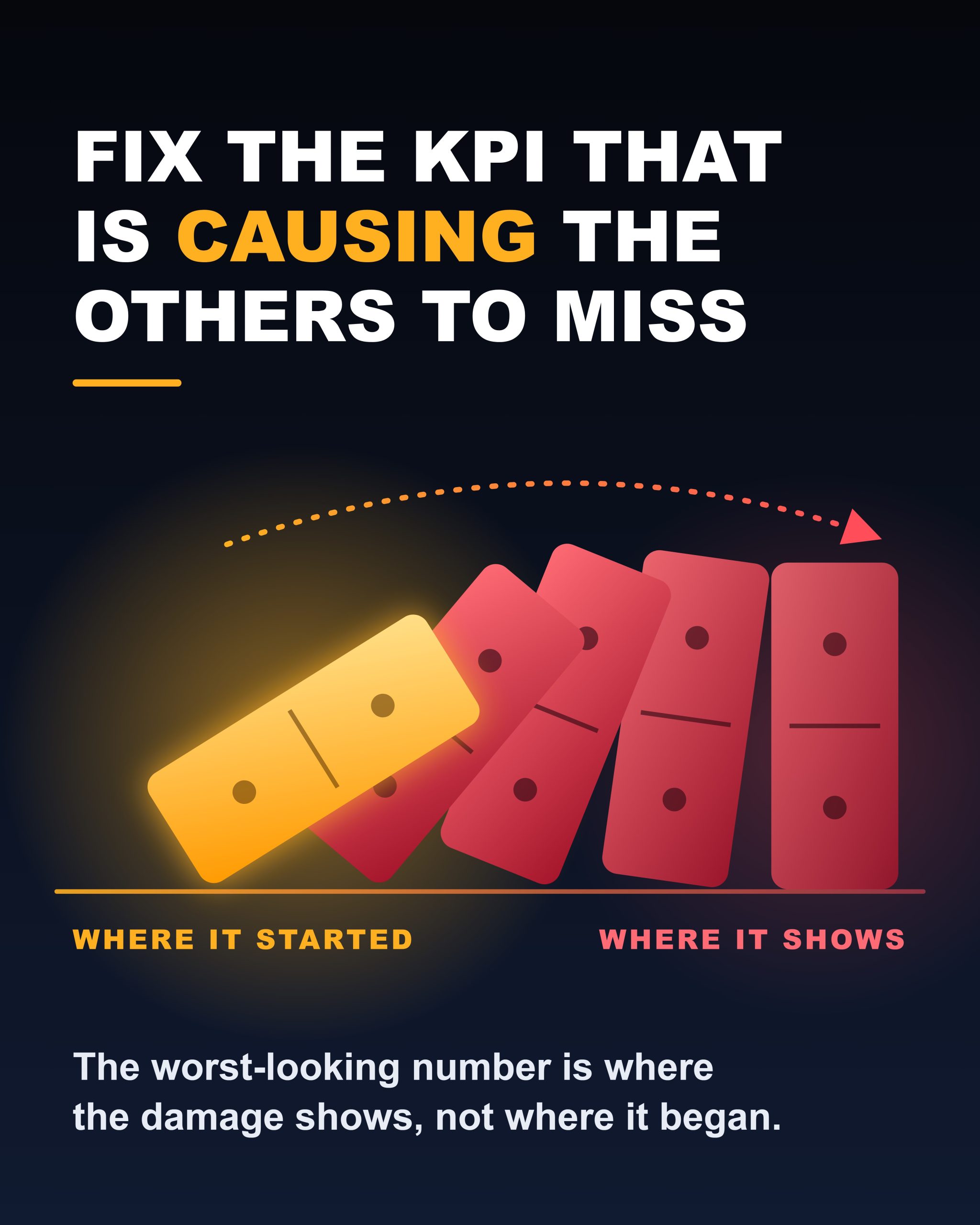
Fix the KPI That Is Causing the Others to Miss
Most managers read a scorecard like a list of problems. Five numbers are red, so there are five jobs. They start with the one that looks worst, or the one their boss asked about, and they push on it.
That’s often the wrong move, because retail KPIs aren’t independent. Traffic, conversion, ATV, margin, labor, and inventory are connected by arithmetic and by customer behavior.
When one breaks, it pulls others out of line with it. So the red number you’re staring at may be the weakest-looking KPI and not the weakest KPI. It may just be the one where the damage shows up most clearly.
Symptom KPIs and source KPIs
A source KPI is one whose miss can explain other misses without needing any of them to explain it. A symptom KPI is one whose miss is at least partly explained by something else on the board.
The distinction matters because pushing on a symptom has a cost. You spend effort, the number barely moves, and sometimes you make the source worse.
Pushing on the source fixes the target and then fixes several others for free.
Some relationships are simple math. Labor percentage is labor dollars divided by sales. If sales fall and the schedule doesn’t change, labor percentage rises even though nobody worked an extra minute.
Margin percentage can fall because of markdowns, discounting, mix shift, or shrink, and each of those has a different upstream cause.
Conversion is the share of visitors who buy, so it can drop because staff weren’t available, because the product wasn’t there, or because the store was unpleasant to shop.
The number tells you that something happened, not what.
Other relationships run through customer behavior. A customer who can’t find the size doesn’t buy, doesn’t add a second item, and sometimes doesn’t come back.
One stockout can touch conversion, ATV, and eventually traffic.
What it looks like in a real store
Take a mid-sized apparel store that finishes a month with sales down 8% against plan. The scorecard looks like this:
- Traffic is flat to slightly down.
- Conversion has dropped noticeably.
- ATV is about the same.
- Labor percentage is over target.
- Margin percentage is under target.
- Inventory looks heavy.
The manager looks at labor first. It’s the most visible overage, and it’s the one the district manager keeps mentioning.
So the manager trims hours: fewer people on weekday afternoons, a lighter close shift. Labour dollars come down. Labour percentage improves a little. Sales fall further.
What the manager missed is the order things happened in.
Three weeks earlier, the store’s best-selling denim style broke in its core sizes, and two of the top-selling tops sold through before the replenishment arrived.
Customers came in, couldn’t find their size, and left. Traffic held because people still came. Conversion fell because the products they came for weren’t there.
Sales fell because of conversion. Labour percentage rose because sales fell. Margin fell because the store marked down the slow, leftover inventory to hold volume.
Inventory looks heavy because it’s the wrong inventory: too much of what isn’t selling and too little of what is.
One upstream problem, availability in the core range, produced four visible misses. The labor cut didn’t touch any of them.
It reduced the staff available to rescue sales on the floor, so conversion got worse.
If the manager had started with inventory, the sequence is different. Fix the core size breaks, redirect stock, pull the best sellers forward on the floor, and conversion recovers.
Sales recover with it. Labour percentage corrects without anyone touching the schedule, and markdown pressure eases because the right product is moving at full price.
The numbers in that example are illustrative, but the pattern is real. It shows up whenever a store reads the scorecard top to bottom instead of tracing the chain.
The three tests
You don’t need a model to find the source. You need three questions, asked in order, about every KPI that’s missing.
The timing test. Which number moved first? Pull the weekly trend, not the monthly total. A monthly summary hides the sequence, and the sequence is the evidence.
If conversion slipped in week two and labor percentage slipped in week three, labor percentage is unlikely to be the cause.
The concentration test. Where is the miss concentrated? A real source usually leaves a fingerprint. The miss clusters in certain hours, certain categories, certain days, or certain staff.
If conversion is down only on weekend afternoons, look at weekend coverage. If it’s down only in one category, look at that category’s stock and presentation.
A miss that’s spread evenly is more likely to be a symptom of something broad, like traffic quality or pricing.
The reversal test. If this KPI were fixed tomorrow, which others would recover without further effort? Say it out loud for each candidate.
If fixing conversion would plausibly repair sales, labour percentage, and probably some margin, conversion is upstream of those.
If fixing labour percentage would repair nothing else, it’s a symptom, or at best a standalone issue. The KPI with the longest list of things it would repair is where you start.
Where most diagnoses go wrong
There are two common errors.
The first is confusing visibility with causality. The KPI that gets the most attention in a review is often the one that’s easiest to measure and easiest to criticize, such as labor or margin.
Those are frequently the last numbers to move in the chain, not the first.
The second is assuming that the biggest miss is the source. Size of miss and position in the chain are different things.
A small slip in availability can create a large drop in sales, and a large labour overage can come entirely from a modest sales shortfall.
There’s also a useful exception to remember. Sometimes the chain runs the other way, and a manager’s own response becomes the new source.
Cutting hours to hit a labour target can reduce conversion, which lowers sales, which raises labour percentage again.
When a fix makes the original number worse, you’ve probably been treating a symptom.
A rule worth carrying
Here’s the version you can repeat to anyone: the KPI that looks worst is where the damage is visible, not necessarily where it started.
And here’s how to use it on Monday morning. Before you assign a single action, list the red KPIs and write one line next to each: caused by something else, or causing something else.
The one with the most arrows pointing out of it gets your first move. Fix that, wait a week, and see which of the others come back on their own.
The ones that don’t are the ones that really needed their own attention.
That last part is the part most managers never get to. Once the source is fixed, the scorecard gets quieter, and what remains is the set of problems that were never symptoms at all.
Separating those from the echoes is a different skill, and it changes what you choose to work on next.
AI Diagnosis
AI Prompt
Act as a sharp retail operations coach who knows that retail KPIs are connected, and that the worst-looking number is often a symptom of an upstream problem. Below is my store’s scorecard and whatever context I could give you: [Paste your KPI results and any context you have, for example: “Sales down 8% vs plan last month. Traffic flat, conversion down from 22% to 18%, ATV about the same, labour 19% vs 16% target, margin 1.5 points under plan, inventory 12% over plan. Conversion started slipping in week 2, mostly weekend afternoons. Our core denim sizes were out of stock for about three weeks, and I’m thinking of cutting weekday hours to fix labour.”] Using only what I’ve given you, work out which KPI is most likely the source and which are symptoms. Sort every KPI I mentioned into source or symptom, and explain in one line each how it connects to the others, using plain arrows to show the chain, such as availability to conversion to sales to labour percentage. Run three tests and show me what each one reveals: the timing test (which number most likely moved first, and what trend data would confirm it), the concentration test (where the miss seems clustered by hour, day, category, or team, and what that points to), and the reversal test (if each candidate KPI were fixed tomorrow, which others would probably recover without further effort). Then name the single upstream KPI I should act on first, give me two or three concrete moves for this week aimed at that source, and tell me what to check after one week to see which other KPIs recovered on their own. Warn me clearly if any fix I mentioned could make the original problem worse by treating a symptom, and say which KPIs are likely standalone problems that will still need their own attention once the source is fixed. Don’t invent numbers, benchmarks, or causes I didn’t give you. Label anything you’re inferring as an inference, and list the one or two missing data points that would most increase your confidence. Keep it direct, scannable, and focused on the strongest findings rather than every possible factor.
AI Output
Source vs. symptom
Source (most likely): availability of core denim sizes
- Core denim out of stock → conversion drops → sales miss → labour % rises
- Core denim out of stock → leftover, slow stock gets marked down → margin falls
- Core denim out of stock → inventory is heavy in the wrong items
Symptoms
- Conversion: a downstream effect of customers not finding what they came for. (Inference: it’s also where the damage shows most clearly.)
- Sales vs plan: follows conversion, since traffic and ATV held.
- Labor %: partly a symptom, because sales are down. See the math below.
- Margin: likely markdown pressure from the stock that isn’t selling. (Inference: you didn’t mention markdowns, so confirm this.)
- Inventory: probably a mix problem, not a volume problem. (Inference.)
Not part of the chain: traffic (flat) and ATV (about the same). They’re evidence that the problem is happening after customers walk in, not before.
The three tests
Timing test. Conversion slipped in week 2, and the denim stockout ran about three weeks. That fits availability moving first. Labor %, margin, and inventory are all consequences that would show up later.
To confirm, pull weekly (not monthly) data for these, and check that conversion drops in the same week the core sizes broke:
- Core denim in-stock rate by size.
- Weekly conversion.
- Weekly markdown dollars.
Concentration test. The miss is clustered on weekend afternoons. That points to a peak-traffic window where the product gap or floor coverage bites hardest. (Inference: weekends are when the most customers hit the missing sizes, so a stockout shows up there first. It could also be thin weekend coverage. These can both be true, so check the denim wall’s stock level at those times.) If conversion is fine in other categories, the stockout explanation gets stronger.
Reversal test. If each were fixed tomorrow:
- Denim availability: conversion likely recovers, which recovers sales, which pulls labour % down, and markdown pressure eases. The longest list of repairs.
- Conversion alone: recovers sales and labour %, but it doesn’t explain why conversion fell, so the problem would likely return.
- Labour %: repairs nothing else.
- Margin: repairs nothing else.
Act first on: core denim availability
This week:
- Pull the size-level stock report for core denim and rank the broken sizes by how much they normally sell.
- Request replenishment or an inter-store transfer for those sizes, and ask for a delivery date.
- Until stock lands, get what you do have onto the floor: consolidate sizes, put alternative fits where customers look first, and brief weekend staff on what to offer when someone can’t find their size.
Check after one week:
- Did weekend-afternoon conversion move?
- Did sales close the gap to plan?
- Did labor % fall without schedule changes?
- Did markdown dollars slow?
Warning: cutting weekday hours
This is likely the symptom-fix trap. Your problem shows up on weekend afternoons, so cutting weekday hours may not touch it. Trimming coverage can also reduce the staff available to rescue sales on the floor, which could push conversion down further and raise labour % again. Hold off until the source is addressed.
Likely standalone problem: labor
Quick math, using only your numbers: if labour dollars were on plan and sales are 8% under plan, labour % would land around 17.4%, not 19%. (Inference: this assumes your 16% target and your sales plan line up.) So the sales miss explains roughly half of the overage. The rest may be labour dollars above plan, and that needs its own look once the source is fixed.
Things that don’t add up (inference)
Conversion fell about 18% in relative terms (22% to 18%) with flat traffic and ATV, which would imply a bigger sales drop than 8%. The likely explanation is that conversion is compared to last period while sales is compared to plan. Confirm which baseline each uses.
Missing data that would raise confidence most
- Weekly in-stock rate for core denim sizes, lined up against weekly conversion.
- Markdown dollars by week, to confirm whether margin is a downstream effect of the stockout.