Retailers are trained to notice sales lifts.
A product goes on a promotional display. Unit sales rise. Revenue increases. The display appears to be working.
That conclusion is often reached far too quickly.
The featured SKU may indeed be selling more, but that doesn’t automatically mean the promotion created additional demand for the business. Some of those sales may simply have moved from somewhere else.
Customers who would normally have bought a competing brand may have switched to the promoted one.
Customers who would have bought the same product from its normal shelf position may now be picking it up from the display.
Customers who might have purchased another item in the category may have substituted the promoted item instead.
In each case, the featured SKU records a lift. But the retailer hasn’t necessarily created much new economic value.
This gives us a useful distinction:
Sales lift tells you what moved. Incrementality tells you what was added.
Those are not the same question.
If you only measure the promoted item, you can easily congratulate a display for rearranging sales that were already going to happen.
The better question isn’t:
“Did the featured product sell more?”
It is:
“What happened to the business around it?”
That one change in perspective makes promotional analysis far more useful.
Follow the displaced sale
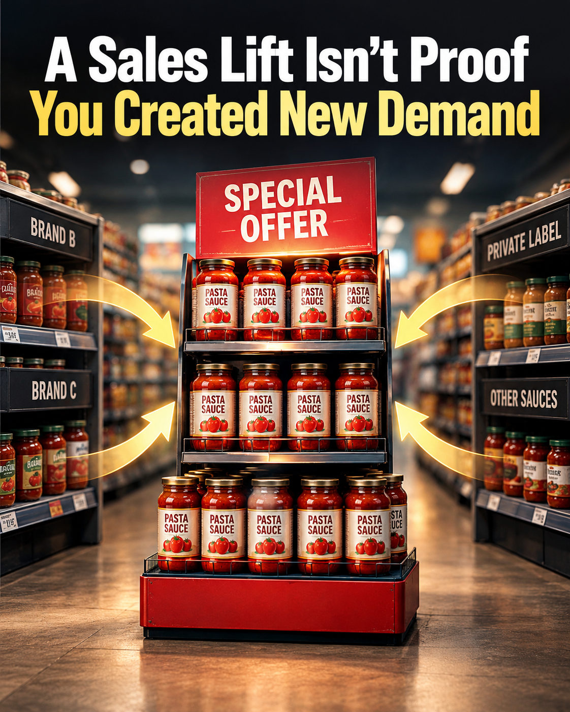
Imagine a supermarket creates an endcap for a premium pasta sauce.
Under normal conditions, the featured sauce sells 200 jars a week. During the promotion, it sells 350.
A 75 percent increase looks excellent.
If you’re reviewing only the featured SKU, you may conclude that the display generated 150 additional jar sales.
Now look at the rest of the category.
Before the promotion:
- Featured brand: 200 jars
- Brand B: 180 jars
- Brand C: 160 jars
- Private label: 260 jars
- Other sauces: 200 jars
Total category sales: 1,000 jars.
During the promotion:
- Featured brand: 350 jars
- Brand B: 130 jars
- Brand C: 120 jars
- Private label: 230 jars
- Other sauces: 190 jars
Total category sales: 1,020 jars.
The promoted brand gained 150 units.
The category gained only 20.
That changes the interpretation completely.
Most of the apparent success didn’t come from creating new pasta sauce demand. It came from shifting customers from other sauces to the promoted sauce.
That doesn’t automatically make the promotion bad.
The featured product may carry a higher margin. The supplier may be funding the display. The retailer may intentionally be trying to grow a strategic brand. The promotion may improve future repeat purchase.
But now you’re evaluating the promotion based on what it actually did.
Without the category view, you might say:
“The display generated 150 extra sales.”
With the category view, a more accurate statement is:
“The display shifted substantial volume toward the featured brand while producing only a modest increase in total category sales.”
Those two conclusions lead to very different decisions.
One might encourage you to repeat the promotion everywhere.
The other might make you ask whether the transferred sales were financially advantageous enough to justify the display space, discount, labour, and promotional support.
That is the deeper issue.
A promotional display doesn’t operate in isolation. It sits inside a system of competing products, limited customer demand, finite store traffic, and finite basket spending.
When one product rises, something else may fall.
So when you see a lift, learn to look for the shadow it casts.
That shadow is the sales that disappeared somewhere else.
Three places the lift may have come from
A useful way to diagnose a promotion is to trace the additional sales into three buckets.
The first bucket is incremental demand.
These are purchases that probably would not have happened without the promotion.
Perhaps the display reminded customers of a need. Perhaps it increased purchase frequency. Perhaps it encouraged someone who wasn’t planning to buy from the category to enter it. Perhaps a compelling placement created a genuinely additional impulse purchase.
This is the outcome most retailers hope they created.
The second bucket is transferred demand.
The customer was already going to buy something in the category, but the promotion changed which product received the sale.
A shopper who normally buys Brand B sees Brand A on the endcap and switches.
The featured SKU records a win.
The category may gain nothing.
The third bucket is relocated demand.
The customer was already going to buy the exact same product, but the promotional display changed where the product was picked up.
This is particularly easy to misread.
Suppose a soft drink normally sells 500 units from the beverage aisle. A large front-of-store display is added, and the display sells 220 units.
Someone may report:
“The display generated 220 unit sales.”
But if the regular shelf location falls from 500 units to 330 during the same period, the total product has moved from 500 to 550.
The display didn’t create 220 additional sales.
It created about 50 additional product sales while relocating a large portion of the existing demand.
Again, the display may still be worthwhile. But the correct measurement is very different.
This is why display sales alone are one of the weakest ways to judge display effectiveness.
The display can look busy while doing very little economically.
The same principle applies to promotional tables, checkout fixtures, feature walls, digital recommendations, bundled offers, online merchandising placements, and many other retail interventions.
Whenever you make something more visible, ask what customers stopped buying, ignored, postponed, or substituted.
The gain is only half the story.
Use the category-and-basket test
A practical way to examine incrementality is to look through three progressively wider lenses.
Start with the featured SKU.
Did sales increase?
You need to know that, but don’t stop there.
Next, widen the lens to the category.
Did total category sales increase, or did the featured SKU mainly take share from neighbouring products?
If the promoted product rises by $5,000 while the rest of the category falls by $4,300, the promotion hasn’t created a $5,000 category opportunity.
It has created roughly $700 of category growth plus a large redistribution of existing sales.
Then widen the lens again to the basket.
What happened to total transaction value among customers who bought the promoted item?
This matters because category growth alone can still hide substitution elsewhere.
Consider a home goods retailer promoting a $79 countertop appliance.
The display performs strongly. Small appliance sales rise.
But customers buying the promoted appliance may be reducing spending elsewhere in the same trip. Perhaps they skip the kitchen accessory, storage item, or cookware purchase they otherwise would have made.
The appliance category looks stronger, but the total basket barely changes.
Now consider a different outcome.
Customers who buy the promoted appliance also frequently add filters, cleaning products, accessories, or related consumables.
The basket rises meaningfully.
That is a very different kind of promotional value.
This leads to a simple diagnostic sequence:
SKU lift → Category lift → Basket lift
Each step asks a harder and more commercially meaningful question.
The SKU tells you whether the item moved.
The category tells you whether demand expanded or shifted.
The basket tells you whether the customer relationship became more valuable during the transaction.
You won’t always have perfect data to calculate true incrementality. Retail environments are messy. Traffic changes. Weather changes. Competitors promote. Paydays occur. Seasonality shifts. Product availability varies.
The goal isn’t to pretend you can identify causality with mathematical certainty from every store promotion.
The goal is to stop treating the featured SKU’s increase as sufficient evidence.
Even imperfect surrounding data can improve the decision.
Compare the category before, during, and after the promotion.
Compare similar stores where the promotion wasn’t used, if that comparison is available and reasonably matched.
Check whether related SKUs declined.
Look at units as well as revenue so price changes don’t disguise what happened.
Examine gross margin dollars, not just sales dollars.
Look at average basket value for transactions containing the promoted item.
Check whether attach items increased.
See whether the promoted product remained elevated after the display ended or immediately returned to baseline.
These signals won’t always produce a perfect answer. They will usually produce a better one.
And sometimes they reveal something even more useful than whether the promotion “worked.”
They show you what kind of promotion you actually ran.
You may discover that a display is excellent at switching customers toward a higher-margin brand.
You may discover it grows the whole category.
You may discover it increases basket size because the promoted item triggers complementary purchases.
Or you may discover it mostly relocates purchases that would have happened anyway.
Those are four fundamentally different outcomes, even though all four could produce an impressive sales number on the display report.
That distinction protects retailers from one of the most common analytical mistakes in merchandising: confusing visible activity with incremental value.
A busy display feels productive.
A fast-selling promotional item feels successful.
A large percentage increase looks persuasive in a report.
But retail performance shouldn’t be judged by how dramatic one number looks. It should be judged by what changed economically because the intervention occurred.
So the next time a promoted SKU jumps, don’t ask only, “How much did it sell?”
Ask three questions:
What did the SKU gain?
What did the surrounding category lose or gain?
What happened to the total basket?
Then apply the rule worth remembering:
Don’t credit a promotion for moving a sale until you’ve checked whether it actually created one.
Once you start looking this way, another issue becomes visible too: some promotions that produce only modest unit growth can still be highly valuable because they improve margin, basket composition, or future purchasing behavior.
Incrementality tells you whether demand was added. It doesn’t, by itself, tell you whether that added demand was profitable.
AI Diagnosis
AI Prompt
Analyze this retail promotion using the sequence SKU lift → category lift → basket lift, and determine whether the apparent sales gain is most likely incremental demand, transferred demand, relocated demand, or a mix of these. Use only the information I provide, distinguish facts from reasonable inferences, and don’t assume that a featured SKU increase equals new demand. Show me: 1) what happened to the featured SKU, 2) what happened to the surrounding category, 3) what happened to total basket value or related-item purchasing if that information is available, 4) where the additional sales most likely came from, 5) what evidence suggests true incrementality versus substitution or relocation, 6) what important data is missing, and 7) the most commercially useful conclusion I can make without overstating certainty. If figures are provided, calculate the differences clearly and point out cases where the promoted item’s lift is much larger than the category or basket lift. End with a concise decision statement explaining whether the promotion appears to have created new demand, shifted existing demand, relocated existing purchases, or produced an unclear mixed result, and identify the single most useful next comparison or measurement. [Paste or describe your promotion results here. Example: “A pasta sauce endcap ran for one week. The promoted brand increased from 200 to 350 jars. Brand B fell from 180 to 130, Brand C from 160 to 120, private label from 260 to 230, and other sauces from 200 to 190. Total category sales increased from 1,000 to 1,020 jars. Average basket value for transactions containing the promoted sauce increased from $46.20 to $47.10. The sauce was discounted by 10%.”]
AI Output
Promotion diagnosis: SKU lift → category lift → basket lift
1) Featured SKU: strong lift
The promoted pasta sauce increased from 200 to 350 jars.
- Unit increase: +150 jars
- Percentage increase: +75%
Viewed by itself, the endcap appears highly successful. But the 150-unit increase is not evidence that the promotion created 150 new purchases.
That becomes clear when we widen the lens.
2) Category: almost all of the SKU lift was offset elsewhere
Total category sales increased from 1,000 to 1,020 jars.
- Category increase: +20 jars
- Percentage increase: +2%
Meanwhile, the other products declined:
| Product | Before | During | Change |
|---|---|---|---|
| Promoted brand | 200 | 350 | +150 |
| Brand B | 180 | 130 | -50 |
| Brand C | 160 | 120 | -40 |
| Private label | 260 | 230 | -30 |
| Other sauces | 200 | 190 | -10 |
| Category total | 1,000 | 1,020 | +20 |
The non-promoted products collectively lost 130 units.
That is the critical finding.
The featured SKU gained 150 units, but the whole category gained only 20.
Put another way, about 87% of the promoted SKU’s 150-unit increase was offset by declines elsewhere in the category:
130 ÷ 150 = 86.7%
This doesn’t prove that every one of those 130 units was directly transferred to the promoted brand. We don’t have customer-level substitution data. But the pattern provides strong evidence that transferred demand was a major component of the apparent lift.
The headline result is therefore not:
The endcap created 150 additional sauce purchases.
A more defensible interpretation is:
The endcap shifted substantial category volume toward the promoted brand while the total category grew only modestly.
That is a very different commercial result.
3) Basket: a small positive movement
Average basket value for transactions containing the promoted sauce increased from $46.20 to $47.10.
That’s:
- Dollar increase: +$0.90
- Percentage increase: approximately +1.9%
This is directionally positive, but it shouldn’t be overinterpreted.
We know that baskets containing the promoted sauce were slightly larger during the promotion. We don’t know why.
For example, customers may have bought complementary items. Or the mix of customers buying the sauce may simply have changed.
We also don’t know what happened to average basket value across all transactions, so this figure doesn’t establish that the promotion increased total store spending.
The basket result therefore provides a weak positive signal, not strong evidence of incrementality.
4) Where did the 150 additional SKU sales most likely come from?
Based strictly on the figures supplied, the best interpretation is a mix dominated by transferred demand.
There are three possible sources.
Transferred demand is strongly indicated.
Other sauces lost 130 units while the promoted brand gained 150. The timing and magnitude of those declines are consistent with customers switching from competing sauces to the promoted brand.
That means a substantial portion of the display’s apparent success probably came from redistributing purchases within the category.
Incremental demand is possible, and the category data suggests some.
The entire sauce category increased by 20 units.
Assuming the before and during periods are reasonably comparable, those 20 additional category units are consistent with some incremental category demand.
But we cannot confidently say the promotion caused all 20. Traffic, seasonality, other promotions, normal weekly variation, and other factors could also have contributed.
So 20 units is evidence consistent with incrementality, not proof of 20 incremental units caused by the endcap.
Relocated demand cannot be measured from the information supplied.
Some customers may have been planning to buy the promoted brand anyway and simply picked it up from the endcap rather than its usual shelf location.
The total promoted-brand sales figure doesn’t tell us how many of the 350 sales came from customers whose purchase decision existed before they encountered the display.
So relocation may be present, but there isn’t enough information to quantify it.
5) What points toward true incrementality?
The strongest evidence is the 20-unit increase in the total category.
If the promotion had produced nothing except brand switching, total category volume would theoretically remain around 1,000 units.
Instead, it reached 1,020.
The slight 1.9% increase in baskets containing the promoted sauce also points in a positive direction, although it is much less conclusive.
What argues against interpreting the SKU lift as predominantly incremental is much stronger:
Promoted SKU: +75%
Category: +2%
Relevant baskets: +1.9%
That gap is the key analytical signal.
The promotional item exploded upward, while the economic environment around it barely moved.
That’s exactly the pattern retailers should watch for when distinguishing visible promotional lift from genuine demand creation.
6) Important information that’s missing
Several pieces of information would materially improve the diagnosis.
We don’t know the sales from the promoted brand’s normal shelf location versus the endcap, so relocated demand can’t be isolated.
We don’t know whether store traffic changed during the week.
We don’t have comparable results from stores without the endcap or from a suitably comparable historical period.
We don’t know whether competing brands were out of stock or had different prices.
We don’t have gross-margin information. This matters especially because the promoted sauce was discounted 10%.
The promotion may therefore have shifted customers toward the featured brand while also reducing margin per unit. Conversely, supplier funding or a favourable product margin could make the switch financially attractive. The information provided doesn’t allow that determination.
We also don’t know whether complementary products increased, so the $0.90 basket increase can’t be attributed to useful attachment sales.
7) The commercially useful conclusion
The promotion produced a very strong SKU result but a weak category-level lift.
That distinction matters more than the impressive 75% SKU increase.
Out of a 150-unit increase in the promoted product, 130 units were accompanied by declines elsewhere in the sauce category, while total category volume increased by only 20 units.
So the promotion appears to have been much more effective at redirecting existing demand toward the promoted brand than at expanding total category demand.
That does not mean the endcap failed.
If switching customers toward this particular brand was strategically or financially valuable, the promotion may still have been worthwhile.
But the evidence doesn’t support treating 150 additional promoted-brand units as 150 newly created sales.
The 10% discount makes the next commercial question particularly important: was the modest category and basket growth enough to compensate for the discount and any margin lost through product switching?
Decision statement
This promotion appears to have produced a mixed result dominated by transferred demand, with some possible incremental demand and an unknown amount of relocated demand. The SKU gained 150 units, but the category gained only 20, so the featured SKU’s sales lift substantially overstates the apparent creation of new demand.
The single most useful next comparison would be a matched control store or comparable non-promotional period, measuring total category units, category revenue, and gross margin.
That would make it much easier to determine whether the 20-unit category increase was genuinely caused by the promotion rather than normal variation.
The rule to carry forward is simple:
When the SKU lift is large but the category and basket barely move, you’re probably looking at demand movement more than demand creation.