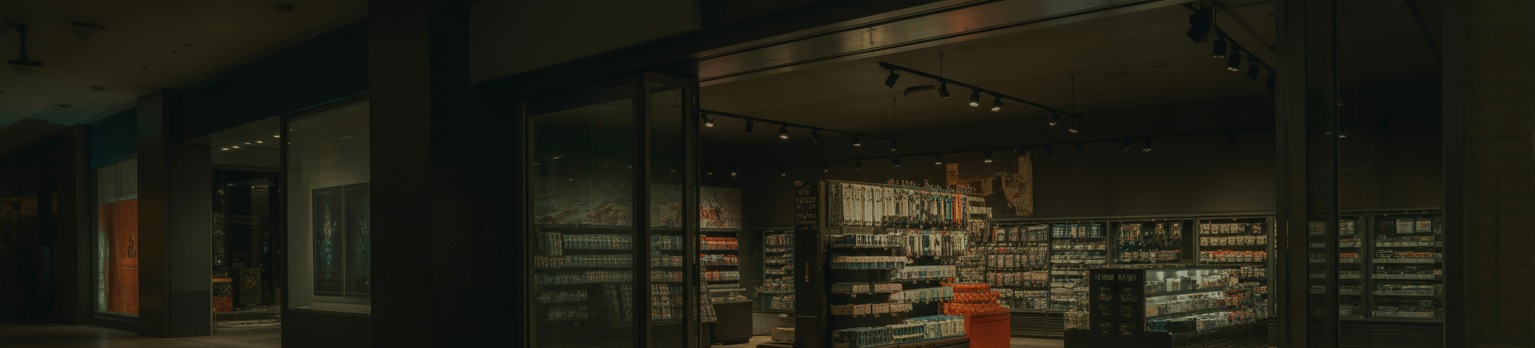
Asymmetrical Balance in Visual Merchandising
Asymmetrical balance is a sophisticated and dynamic principle of design that, when applied effectively in visual merchandising, can create compelling, engaging, and modern retail displays.
Unlike symmetrical balance which relies on mirroring elements, asymmetrical balance achieves equilibrium through the careful arrangement of dissimilar elements that hold equal visual weight or appeal.
This report explores the definition, principles, benefits, practical application, and considerations for leveraging asymmetrical balance to enhance retail aesthetics and customer engagement.
Introduction to Asymmetrical Balance
In design, balance refers to the visual distribution of weight in a composition.
While symmetrical balance provides a sense of formality, order, and stability by arranging identical or similar elements on either side of a central axis, asymmetrical balance offers a more informal, dynamic, and often more interesting approach.
It involves arranging diverse elements (different sizes, shapes, textures, colors, or values) in a way that their combined visual impact creates a sense of equilibrium without being identical.
In visual merchandising, mastering asymmetrical balance allows for more creative freedom and the ability to break away from conventional, rigid displays, leading to more captivating and memorable retail experiences.
Principles of Asymmetrical Balance
Achieving asymmetrical balance requires an understanding of how different visual elements contribute to the overall perceived weight. Key principles include:
- Size vs. Number: A single large item can be balanced by several smaller items. For example, one large product display can be balanced by a cluster of smaller accessories positioned further away.
- Contrast in Value/Color: A small, high-contrast or brightly colored item can balance a larger, more neutral or muted item. A vibrant red handbag, for instance, might balance a larger display of grey apparel.
- Texture and Detail: Highly textured or detailed items carry more visual weight than smooth or plain items. A richly embroidered garment, even if small, can balance a larger, simpler piece.
- Position/Placement: Elements placed further from the center of a display or a perceived fulcrum will exert more visual pull than those placed closer. This is akin to a seesaw where a lighter object further out can balance a heavier object closer to the pivot.
- Shape and Form: Irregular or complex shapes tend to have more visual weight than simple, geometric shapes.
- Dominant vs. Subordinate Elements: One dominant element can be balanced by a combination of subordinate elements that together create equilibrium.
- Empty Space (Negative Space): The strategic use of negative space around elements can also contribute to balance, providing visual breathing room and emphasizing certain features.
Benefits of Asymmetrical Balance in Visual Merchandising
Employing asymmetrical balance in visual merchandising offers several distinct advantages:
- Increased Visual Interest and Engagement: The unexpected arrangement of elements creates a more dynamic and intriguing display, encouraging customers to pause, explore, and discover. It avoids monotony often associated with purely symmetrical layouts.
- Modern and Contemporary Aesthetic: Asymmetrical balance lends itself to a modern, sophisticated, and artistic feel, appealing to contemporary design sensibilities.
- Flexibility and Creativity: It offers greater freedom for visual merchandisers to experiment with different products, sizes, and forms without being constrained by rigid mirroring. This is particularly useful when dealing with disparate product types.
- Highlights Individual Products: By avoiding identical pairings, asymmetrical displays can draw more attention to individual products or collections, giving each item its own moment.
- Accommodates Varied Inventory: It is highly effective for displaying products that come in different sizes, shapes, and quantities, which is common in many retail environments.
- Creates a Sense of Movement: The non-static nature of asymmetrical balance can imply movement and energy, making the display feel more vibrant.
Practical Application in Visual Merchandising
Implementing asymmetrical balance requires a thoughtful approach:
- Window Displays: Instead of mirroring two mannequins, place one prominently to one side and balance it with a smaller group of accessories or a contrasting graphic element on the other side. Use different heights for platforms or props.
- Mannequin Groupings: Arrange mannequins in varied stances and at different heights, creating a natural, less rigid grouping. One standing mannequin might be balanced by a seated one, plus a display of shoes on the floor.
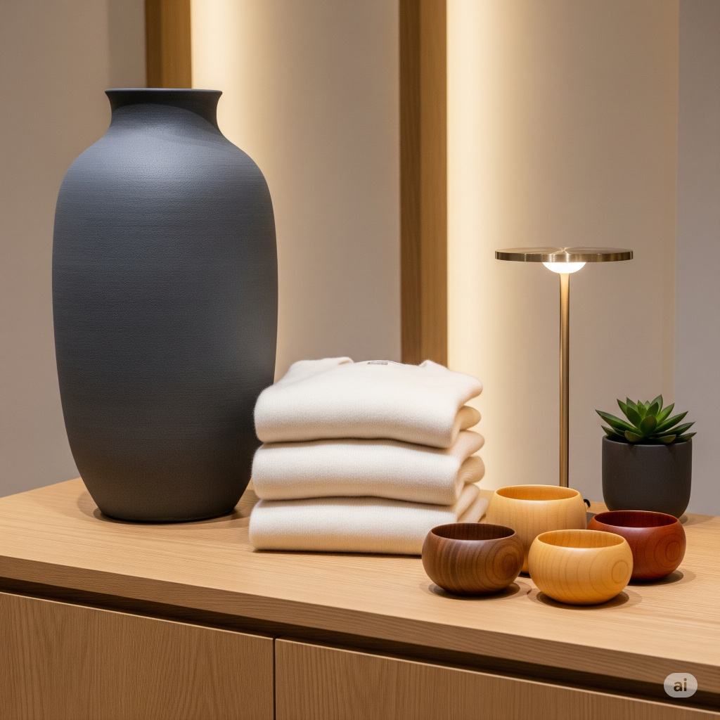
- Shelving and Fixtures: On shelves, group items of varying heights and sizes. A tall vase on one side can be balanced by a cluster of smaller books and decorative objects on the opposite side. Consider using odd numbers of items for a more natural look.
- Table Displays: Arrange products on a table in an organic, flowing manner rather than lining them up. Place a dominant item off-center and balance it with smaller, complementary items distributed around it. Vary the elevation of items using risers or boxes.
- Wall Displays/Story Walls: When creating a product story on a wall, use different sized frames, products, or graphic elements. A large central image could be balanced by smaller, strategically placed product shots or descriptive text to its sides.
- Color Blocking and Texture Contrast: Use a small section of a bold color to balance a larger area of a more subdued color. Similarly, a highly textured product can balance a larger, smoother one.
- Lighting as a Balancing Element: Strategic lighting can draw attention to a smaller element, increasing its visual weight and helping it balance a larger, less illuminated element.
Considerations and Best Practices
While powerful, asymmetrical balance needs careful execution:
- Maintain Cohesion: Despite the asymmetry, the display must still feel unified and not chaotic. A clear theme, color palette, or product category should tie the elements together.
- Understand Visual Weight: Practice discerning the visual weight of different elements. This comes with experience and observation.
- Avoid Clutter: Asymmetrical balance is about intentional arrangement, not haphazard placement. Too many elements, even if balanced, can lead to clutter.
- Eyeline and Focal Point: Ensure that even with an asymmetrical arrangement, there is a clear focal point or an easy path for the eye to follow through the display.
- Regular Evaluation: Step back and view the display from different angles and distances. Adjust elements until a sense of equilibrium is achieved. Seek feedback from others.
- Brand Consistency: Ensure that the chosen asymmetrical style aligns with the overall brand aesthetic. While it offers flexibility, it should not contradict the brand’s established identity.
- Product Accessibility: Always ensure that while visually balanced, products remain accessible and easy for customers to browse and select.
Conclusion
Asymmetrical balance is a sophisticated and effective visual merchandising technique that moves beyond conventional symmetry to create dynamic, engaging, and modern retail displays.
By understanding the principles of visual weight and thoughtfully arranging diverse elements, visual merchandisers can craft environments that capture attention, foster exploration, and ultimately enhance the customer shopping experience.
Embracing asymmetrical balance allows for greater creativity, accommodates varied inventory, and positions a brand as forward-thinking and aesthetically aware.
Its successful implementation requires keen observation, a practiced eye, and a commitment to continuous refinement, ultimately leading to more compelling and profitable retail spaces.

